5
Unsupervised Learning
5.1 Introduction
While
most
ML
application
nowadays
are
based
on
supervised
learning
This means we have the input features ( ), but do not have the labels ( ). For example we can have the login information of users to a website but have no idea of their name, sex, occupation, etc.
There
is
a
good
quote
by
computer
scientist
If intelligence was a cake, unsupervised learning would be the cake, supervised learning would be the icing on the cake, and reinforcement learning would be the cherry on the cake.
In other words, there is a huge potential in unsupervised learning that we have only barely started to sink our teeth into.
To get a better picture, let’s image a scenario. Let’s say we want to create a system which will take a few pictures of each item on
a manufacturing production line and detect which items are
However we will hit a road block as there are no labels .
To train a regular binary classifier to predict whether an item is defective or not, will need to label every single picture either as
In addition, every time the company makes any change to its products, the whole process will need to be started over from scratch.
These restrictions can make ML either a tedious task at best or a massive time sink at worst. Wouldn’t it be great if the algorithm could just exploit the unlabelled data without needing humans to label every picture?
This is where unsupervised learning shows its performance.
In the previous chapter, we looked at the most common unsupervised learning task,
- Clustering
-
The goal is to group similar instances together into clusters. Clustering is a great tool for data analysis, customer segmentation, recommender systems, search engines, image segmentation, semi-supervised learning, dimensionality reduction, and much more.
- Anomaly Detection
-
The goal is to learn what “normal” data looks like, and then use that to detect abnormal instances. These instances are called anomalies, or outliers, while the normal instances are called
inliers . Anomaly detection is useful in a wide variety of applications, such as fraud detection, detecting defective products in manufacturing, identifying new trends in time series, or removing outliers from a dataset before training another model, which can significantly improve the performance of the resulting model.3 3 Anomaly detection is also known as outlier detection. - Density Estimation
-
This is the task of estimating the PDF of the random process that generated the dataset. Density estimation is commonly used for anomaly detection whereby instances located in very low-density regions are likely to be anomalies. It is also useful for data analysis and visualisation.
5.2 Clustering Algorithms

As
with
all
previous
examples,
let’s
use
our
imagination
and
assume
we
are
enjoying
our
hike
through
the
mountains
of
Tirol,
perhaps
somewhere
in
Nordkette
(
Fig.
5.1
),
and
we
stumble
upon
a
plant
we
have
never
seen
before.
It
could
be
Alpen-Edelweiß
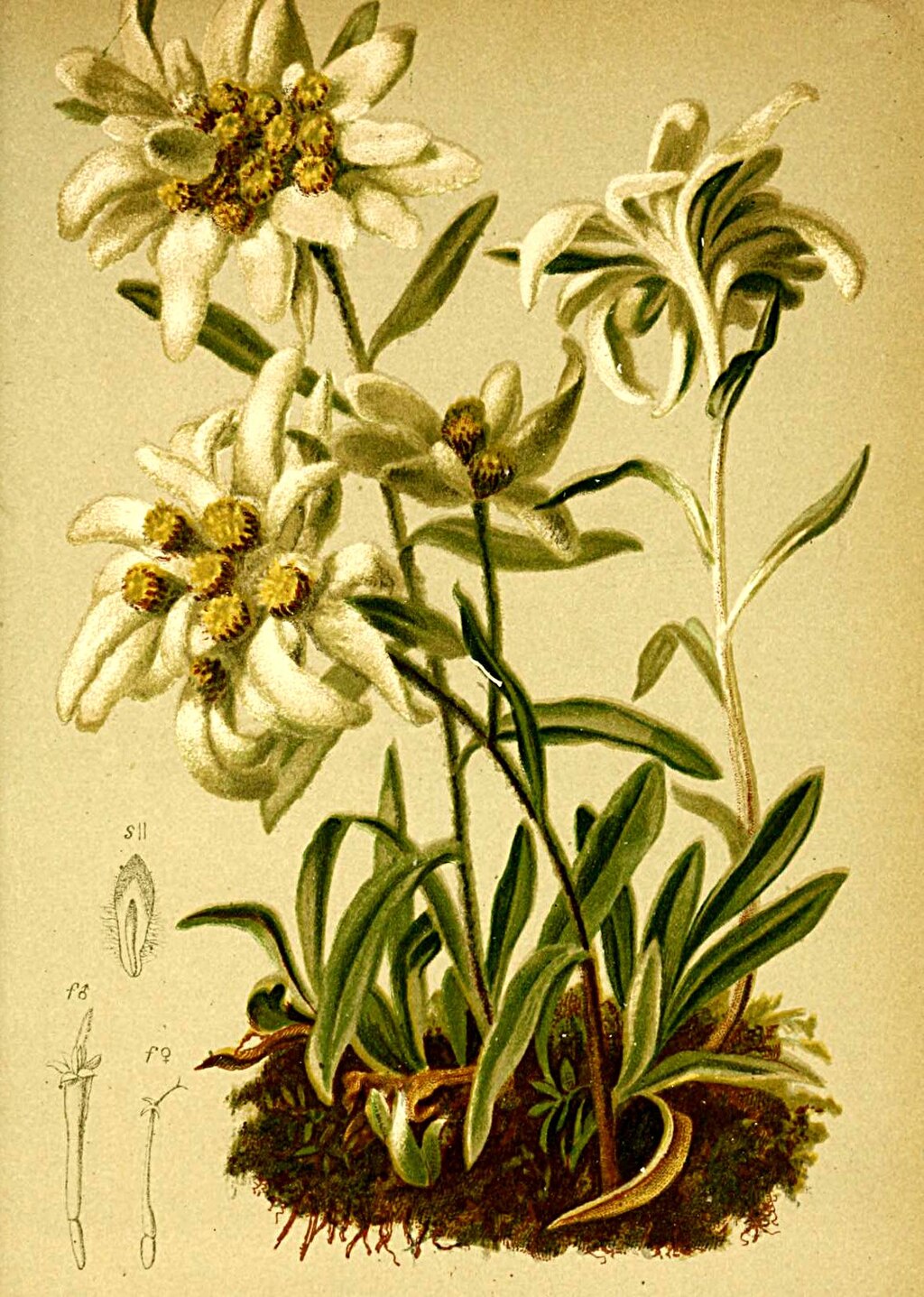
We can’t tell.
We look around and we notice a few more. They are not identical, however they are sufficiently similar for we to know that they most likely belong to the same species. We may need a botanist, or a local, to tell you what species that is, but we certainly don’t need an expert to identify groups of similar-looking objects.

This is called
It is the task of identifying similar instances and assigning them to clusters, or groups of similar instances without knowing what the instance really is.
Similar
to
classification,
each
instance
gets
assigned
to
a
group
.
However,
unlike
classification,
clustering
is
an
On the right is the same dataset, but without the labels, so we cannot use a classification algorithm anymore. This is where
clustering algorithms step in as many of them can easily detect the lower-left cluster. It is also quite easy to see with our own
eyes, but it is not so obvious that the upper-right cluster is composed of two
-
sepal length, and
-
sepal width,
which
are
not
represented
here,
and
clustering
algorithms
can
make
good
use
of
all
features,
so
in
fact
they
identify
the
three
clusters
fairly
well.
Applications Clustering is used in a wide variety of applications, including:
- Customer Segmentation
-
We can cluster our customers based on their purchases and their activity on our website. This is useful to understand who our customers are and what they need, so we can adapt our products and marketing campaigns to each segment [21].
Customer segmentation can be useful in recommender systems to suggest content that other users in the same cluster enjoyed.
- Data analysis
-
When we analyze a new dataset, it can be helpful to run a clustering algorithm, and then analyze each cluster separately.
- Dimensionality reduction
-
Once a dataset has been clustered, it is usually possible to measure each instance’s
affinity with each cluster. Here, affinity is any measure of how well an instance fits into a cluster. Each instance’s feature vector can then be replaced with the vector of its cluster affinities. If there are clusters, then this vector is k-dimensional.The new vector is typically much lower-dimensional than the original feature vector, but it can preserve enough information for further processing.
- Feature engineering
-
The cluster affinities can often be useful as extra features. For example, we used k-means before to add geographic cluster affinity features to the California housing dataset, and they helped us get better performance.
- Anomaly detection
-
Any instance that has a low affinity to all the clusters is likely to be an anomaly. For example, if we have clustered the users of our website based on their behavior, we can detect users with unusual behavior, such as an unusual number of requests per second [22].
- Semi-supervised learning
-
If we only have a few labels, we could perform clustering and propagate the labels to all the instances in the same cluster. This technique can greatly increase the number of labels available for a subsequent supervised learning algorithm, and thus improve its performance [23].
- Search engines
-
Some search engines let you search for images that are similar to a reference image. To build such a system, we first apply a clustering algorithm to all the images in our database. This allows similar images to end up in the same cluster. Then when a user provides a reference image, all we’d need to do is use the trained clustering model to find this image’s cluster, and we could then simply return all the images from this cluster [24].
- Image segmentation
-
By clustering pixels according to their color, then replacing each pixel’s color with the mean color of its cluster, it is possible to considerably reduce the number of different colors in an image. Image segmentation is used in many object detection and tracking systems, as it makes it easier to detect the contour of each object [25].
There is no universal definition of what a cluster is as it really depends on the context, and different algorithms will capture different kinds of clusters. Some algorithms, for example, look for instances centered around a particular point, called a centroid . Others look for continuous regions of densely packed instances: these clusters can take on any shape. Some algorithms are hierarchical, looking for clusters of clusters. And the list goes on.
In this section of our chapter, we will look at two
-
k-means, and
-
DBSCAN,
and explore some of their applications, such as non-linear dimensionality reduction, semi-supervised learning, and anomaly detection.
5.2.1 k-means
Consider the unlabelled dataset represented in
Fig.
5.3
. It is clear to us to say we can clearly see five

Let’s train a -means clusterer on this dataset. It will try to find each blob’s center and assign each instance to the closest blob:
from sklearn.cluster import KMeans
from sklearn.datasets import make_blobs

blob_centers = np.array([[ 0.2,  2.3], [-1.5 ,  2.3], [-2.8,  1.8],
                  [-2.8,  2.8], [-2.8,  1.3]])
blob_std = np.array([0.4, 0.3, 0.1, 0.1, 0.1])
X, y = make_blobs(n_samples=2000, centers=blob_centers, cluster_std=blob_std,
             random_state=42)

k = 5
kmeans = KMeans(n_clusters=k, n_init=10, random_state=42)
y_pred = kmeans.fit_predict(X)
For the method to work, we have to specify the number of clusters ( ) which the algorithm must find.
In this example, as said previously, it is obvious
should be set to five
This
should
not
to
be
confused
with
the
class
labels
in
classification,
which
are
used
as
targets.
The KMeans
instance
preserves
the
predicted
labels
of
the
instances
it
was
trained
on,
available
via
the labels_
instance
variable:
We
can
also
take
a
look
at
the
five
We can easily assign new instances to the cluster whose centroid is closest:
If
we
plot
the
cluster’s
decision
boundaries,
we
get
a
Voronoi
tessellation

The vast majority of the instances were clearly assigned to the appropriate cluster, but a good part of the instances were mislabelled,
Such as parts in the lower left where there is obviously two
Instead
of
assigning
each
instance
to
a
single
cluster,
which
is
called
hard
clustering
,
it
can
be
useful
to
give
each
instance
KMeans
class,
the transform()
method
measures
the
distance
from
each
instance
to
every
centroid:
In
the
aforementioned
example,
the
first
instance
in X_new
is
located
at
a
distance
of
about
2.84
from
the
centroid,
0.59
from
the
centroid,
1.5
from
the
centroid,
2.9
from
the
centroid,
and
0.31
from
the
centroid.
If we have a high-dimensional dataset and we transform it this way, we end up with a k-dimensional dataset. This transformation can be a very efficient non-linear dimensionality reduction technique. Alternatively, we can use these distances as extra features to train another model.
The Operation Principle
Let’s try to understand -means via an example. Suppose we were given the centroids. We could easily label all the instances in the dataset by assigning each of them to the cluster whose centroid is closest. Or, if we were given all the instance labels, we could easily locate each cluster’s centroid by computing the mean of the instances in that cluster.
But here are given neither the labels nor the centroids, so how can we proceed?
We
start
by
placing
the
centroids
randomly.
The algorithm is guaranteed to converge in a finite number of steps.
That’s because the mean squared distance between the instances and their closest centroids can only go down at each step, and since it cannot be negative, it’s guaranteed to converge. We can see the algorithm in action in Fig. 5.5 :

Let’s try to explain the behaviour of the figure.
- 1.
- the centroids are initialised randomly (top left)
- 2.
- then the instances are labelled (top right),
- 3.
- the centroids are updated (center left),
- 4.
- the instances are relabelled (center right),
and so on. As we can see, in just three
Information : Computational Complexity
The computational complexity of the algorithm is
In practice, this rarely happens, and -means is generally one of the fastest clustering algorithms.
Although
the
algorithm
is
guaranteed
to
converge,
it
may
not
converge
to
the
right
solution:

Let’s take a look at a few ways we can mitigate this risk by improving the centroid initialisation.
Centroid initialisation methods
If
we
happen
to
know
approximately
where
the
centroids
should
be,
init
hyperparameter
to
a
numpy
array
containing
the
list
of
centroids,
and
set n_init
to 1
:
Another
solution
is
to
run
the
algorithm
multiple
times
with
n_init
hyperparameter:
by
default
it
is
equal
to
10,
which
means
that
the
whole
algorithm
described
earlier
runs
10
times
when
we
call fit(),
and sklearn
keeps
the
best
solution.
But how exactly does it know which solution is the best? Well, it uses a performance metric. That metric is called the model’s inertia , which is the sum of the squared distances between the instances and their closest centroids.
where is the number of samples, is the value of a sample, is the centre of the cluster centroid. For our example, this value is roughly equal to:
-
219.4 for the model on the left in Fig. 5.12 ,
-
258.6 for the model on the right in Fig. 5.12 ,
-
211.6 for the model in Fig. 5.4 .
The KMeans
class runs the algorithm n_init
times and keeps the model with the
In
this
example,
the
model
in
Fig.
5.4
will
be
selected.
n_init
consecutive
random
initialisation
For
the
curious,
a
model’s
inertia
is
accessible
via
the inertia_
instance
variable:
The score()
method
returns
the
negative
inertia:
sklearn
’s
“greater
is
better”
rule:
if
a
predictor
is
better
than
another,
its score()
method
should
return
a
greater
score
An important improvement to the -means algorithm, -means++, was proposed in a 2006 paper by David Arthur and Sergei Vassilvitskii [28]. They introduced a smarter initialisation step that tends to select centroids that are distant from one another, and this improvement makes the -means algorithm much less likely to converge to a sub-optimal solution.
The paper showed, the additional computation required for the smarter initialisation step is well worth it because it makes it possible to drastically reduce the number of times the algorithm needs to be run to find the optimal solution.
The -means++ initialisation works as follows:
- 1.
- Take one centroid , chosen uniformly at random from the dataset,
- 2.
-
Take the new centroid
,
choosing an instance
with probability:
-
where
is the distance
between the instance
and the closest centroid that was already chosen.
This probability distribution ensures that instances farther away from already chosen centroids are much more likely to be selected as centroids.
- 3.
- Repeat the previous step until all centroids have been chosen.
The KMeans
class uses this initialisation method by
"random".
We will rarely need to do this.
Accelerated and mini-batch
Another
improvement
to
the
-means
algorithm
was
proposed
in
a
2003
paper
by
To give it a try, set algorithm="elkan".
Yet
another
important
variant
of
the
-means
algorithm
was
proposed
in
a
2010
paper
by
David
Sculley [30].
Instead
of
using
the
full
dataset
at
each
iteration,
the
algorithm
is
capable
of
using
sklearn
implements
this
algorithm
in
the MiniBatchKMeans
class,
which
we
can
use
just
like
the KMeans
class:
If
the
dataset
does
not
fit
in
memory,
the
simplest
option
is
to
use
the memmap
class.
Alternatively,
we
can
pass
one
mini-batch
at
a
time
to
the partial_fit()
method,
but
this
will
require
much
more
work,
as
we
will
need
to
perform
multiple
initialisations
and
select
the
best
one
ourselves.
Although the mini-batch -means algorithm is much faster than the regular -means algorithm, its inertia is generally slightly worse. We can see this in Fig. 5.7 . The plot on the left compares the inertiae of mini-batch -means and regular -means models trained on the previous five-blobs dataset using various numbers of clusters . The difference between the two curves is small, but visible. In the plot on the right, we can see that mini-batch -means is roughly 1.5 - 2 times faster than regular -means on this dataset.

Finding the optimal number of clusters
So far, we’ve set the number of clusters
to five

We might be thinking that we could just pick the model with the lowest inertia. Unfortunately, it is not that simple. The inertia for is about 653.2, which is much higher than for with a value of 211.6. But with , the inertia is just 119.1.
The inertia is not a good performance metric when trying to choose as it keeps getting lower as we increase .

As we can see, the inertia drops very quickly as we increase up to 4, but then it decreases much more slowly as we keep increasing k. This curve has roughly the shape of an arm, and there is an elbow at = 4. So, if we did not know better, we might think 4 was a good choice as any lower value would be dramatic, while any higher value would not help much, and we might just be splitting perfectly good clusters in half for no good reason.
This technique for choosing the best value for the number of clusters is rather coarse. A more precise
where
is
the
mean
distance
to
the
other
instances
in
the
same
cluster
(i.e.,
the
mean
intra-cluster
distance)
and
is
the
mean
nearest-cluster
distance
To
compute
the
silhouette
score,
we
can
use sklearn
’s silhouette_score()
function,
giving
it
all
the
instances
in
the
dataset
and
the
labels
they
were
assigned:
Let’s compare the silhouette scores for different numbers of clusters (see Fig. 5.10 ).

As we can see, this visualisation gives more information compared to the previous one:
although it confirms that is a very good choice, it also highlights the fact that is quite good as well, at least much better than or 7.
This was not visible when comparing inertiae.
An
even
more
informative
visualisation
is
obtained
when
we
plot
every
instance’s
silhouette
coefficient,
sorted
by
the
clusters
they
are
assigned
to
and
by
the
value
of
the
coefficient.
This
is
called
a
silhouette
diagram
(see
Fig.
5.11
).
Each
diagram
contains
one
knife
shape
per
cluster.
The
shape’s
height
indicates
the
number
of
instances
in
the
cluster,
and
its
width
represents
the
sorted
silhouette
coefficients
of
the
instances
in
the
cluster
The
vertical
dashed
lines
represent
the
When k = 4, the cluster at index 2 (the second from the top) is rather big. When k = 5, all clusters have similar sizes. So, even though the overall silhouette score from k = 4 is slightly greater than for k = 5, it seems like a good idea to use k = 5 to get clusters of similar sizes.

5.2.2 Limits of K-Means
Despite its many merits, most notably being fast and scalable,
-means
is not perfect. As we saw, it is necessary to run the algorithm several times to avoid sub-optimal
solutions, plus we need to specify the number of clusters, which can be quite a hassle. Moreover,
-means does
not behave very well when the clusters have varying sizes, different densities, or non-spherical shapes. For example,
Fig.
5.12
shows
how
-means
clusters a dataset containing three

As can be seen, neither of these solutions is any good. The solution on the left is better, but it still chops off 25% of the middle cluster and assigns it to the cluster on the right. The solution on the right is just terrible, even though its inertia is lower. So, depending on the data, different clustering algorithms may perform better. On these types of elliptical clusters, Gaussian mixture models work great.
It is important to scale the input features before we run -means, or the clusters may be very stretched and -means will perform poorly. Scaling the features does not guarantee that all the clusters will be nice and spherical, but it generally helps -means.
Now let’s look at a few ways we can benefit from clustering and for these will use -means
5.2.3 Using Clustering for Image Segmentation
Image segmentation is the task of partitioning an image into
- Colour Segmentation
-
pixels with a similar color get assigned to the same segment. This is sufficient in many applications.
For example, if we want to analyze satellite images to measure how much total forest area there is in a region, color segmentation may be just fine.
- Semantic Segmentation
-
all pixels that are part of the same object type get assigned to the same segment.
For example, in a self-driving car’s vision system, all pixels that are part of a pedestrian’s image might be assigned to the
pedestrian segment. - Instance Segmentation
-
all pixels that are part of the same individual object are assigned to the same segment. In this case there would be a different segment for each pedestrian.
The
state
of
the
art
in
semantic
or
instance
segmentation
today
is
achieved
using
complex
architectures
based
on
Convolutional
Neural
Networks
(CNN)
Fruit.png
image
(see
the
upper-left
image
in
Fig.
5.13
),
assuming
it’s
located
at
filepath:
The
image
is
represented
as
a
3D
array.
The
first
dimension’s
size
is
the
height,
the
second
is
the
width,
and
the
third
is
the
number
of
color
channels,
in
this
case
red,
green,
and
blue
(RGB).
In
other
words,
for
each
pixel
there
is
a
3D
vector
containing
the
intensities
of
red,
green,
and
blue
as
unsigned
8-
bit
integers
between
0
and
255.
Some
images
may
have
fewer
channels
segmented_img
array
containing
the
nearest
cluster
centre
for
each
pixel
(i.e.,
the
mean
colour
of
each
pixel’s
cluster),
and
lastly
it
reshapes
this
array
to
the
original
image
shape.
The
third
line
uses
advanced
NumPy
indexing;
for
example,
if
the
first
10
labels
in kmeans_.labels_
are
equal
to
1,
then
the
first
10
colors
in segmented_img
are
equal
to kmeans.cluster_centers_[1]:
X = image.reshape(-1, 3)
kmeans = KMeans(n_clusters=8, n_init=10, random_state=42).fit(X)
segmented_img = kmeans.cluster_centers_[kmeans.labels_]
segmented_img = segmented_img.reshape(image.shape)

segmented_imgs = []
n_colors = (10, 8, 6, 4, 2)

for n_clusters in n_colors:
   kmeans = KMeans(n_clusters=n_clusters, n_init=10, random_state=42).fit(X)
   segmented_img = kmeans.cluster_centers_[kmeans.labels_]
   segmented_imgs.append(segmented_img.reshape(image.shape))
This outputs the image shown in the upper right of Fig. 5.13 . We can experiment with various numbers of clusters, as shown in the figure. When we use fewer than eight clusters, notice that the ladybug’s flashy red color fails to get a cluster of its own: it gets merged with colors from the environment. This is because -means prefers clusters of similar sizes. The ladybug is small-much smaller than the rest of the image-so even though its colour is flashy, -means fails to dedicate a cluster to it.

Now this looks very pretty. Now it is time to look at another application of clustering.
5.2.4 Using Clustering for Semi-Supervised Learning
Another use case for clustering is in
We will pretend we only have labels for 50 instances. To get a baseline performance, let’s train a logistic regression model on these 50 labelled instances:
We can then measure the accuracy of this model on the test set:
The test set must be labelled:
The model’s accuracy is just 75.8%. That’s not great: indeed, if we try training the model on the full training set, we will find that it will reach about 90.9% accuracy. Let’s see how we can do better. First, let’s cluster the training set into 50 clusters. Then, for each cluster, we’ll find the image closest to the centroid. We’ll call these images the representative images where we can see 50 of them in Fig. 5.14

Let’s look at each image and manually label them:
Now we have a dataset with just 50 labelled instances, but instead of being random instances, each of them is a representative image of its cluster. Let’s see if the performance is any better:
Wow! We jumped from 75.8% accuracy to 83.8%, although we are still only training the model on 50 instances.
Since it is often costly and painful to label instances, especially when it has to be done manually by experts, it
is a good idea to label representative instances rather than just random instances. But perhaps we can go one
step further: what if we propagated the labels to all the other instances in the same cluster? This is called
Now let’s train the model again and look at its performance:
We got another significant accuracy boost.
Active Learning
Information : Active Learning
To continue improving our model and our training set, the next step could be to do a few rounds of active learning,
which is when a human expert interacts with the learning algorithm, providing labels for specific instances when the
algorithm requests them. There are many different strategies for active learning, but one of the most common ones is
called
- 1.
- The model is trained on the labelled instances gathered so far, and this model is used to make predictions on all the unlabeled instances.
- 2.
- The instances for which the model is most uncertain( i.e.,where its estimated probability is lowest) are given to the expert for labelling.
- 3.
- We iterate this process until the performance improvement stops being worth the labeling effort.
Other active learning strategies include labeling the instances that would result in the largest model change or the largest drop in the model’s validation error, or the instances that different models disagree on (e.g., an SVM and a random forest).
Before we move on to Gaussian mixture models, let’s take a look at Density-Based Spatial Clustering of Applications with Noise (DBSCAN) , another popular clustering algorithm that illustrates a very different approach based on local density estimation. This approach allows the algorithm to identify clusters of arbitrary shapes.
5.2.5 DBSCAN
The DBSCAN algorithm defines clusters as continuous regions of high density. Here is how it works:
- 1.
- For each instance, the algorithm counts how many instances are located within a small distance from it. This region is called the instance’s -neighbourhood.
- 2.
-
If
an
instance
has
at
least
min_samplesinstances in its -neighborhood (including itself), then it is considered a core instance. In other words, core instances are those that are located in dense regions. - 3.
- All instances in the neighborhood of a core instance belong to the same cluster. This neighbourhood may include other core instances, therefore, a long sequence of neighboring core instances forms a single cluster.
- 4.
-
Any
instance
that
is
not
a
core
instance
and
does
not
have
one
in
its
neighborhood
is
considered
an
anomaly .
This algorithm works well if all the clusters are well separated by low-density regions. The
DBSCAN
class in sklearn
is as simple
to use as we might expect. Let’s test it on the moons dataset, which is a toy dataset:
The labels of all the instances are now available in the labels_
instance variable:
Notice that some instances have a cluster index equal to -1, which means that they are considered as anomalies by the algorithm.
The core instances indices are available in the core_sample_indices_
instance variable, and the core instances themselves are
available in the components_
instance variable:
This clustering is represented in the Left Hand Side (LHS) plot of Fig. 5.15 . As we can see, it identified quite a lot of anomalies, plus seven different clusters. Fortunately, if we widen each instance’s neighbourhood by increasing eps to 0.2, we get the clustering on the right, which looks much better. Let’s continue with this model.

For example, let’s train a KNeighborsClassifier
:
Now, given a few new instances, we can predict which clusters they most likely belong to and even estimate a probability for each cluster:
Note that we only trained the classifier on the core instances, but we could also have chosen to train it on all the instances, or all but the anomalies.
This choice depends on the final task
X_new
). Notice that since there is no anomaly in the training set, the classifier

always chooses a cluster, even when that cluster is far away. It is fairly straightforward to introduce a maximum distance, in
which case the two instances that are far away from both clusters are classified as anomalies. To do this, use the kneighbors()
method of the KNeighborsClassifier. Given a set of instances, it returns the distances and the indices of the
-nearest neighbours in the training
set (two matrices, each with
columns):
In short,
DBSCAN
is a very simple yet powerful algorithm capable of identifying any number of clusters of any shape. It is robust
to outliers, and it has just two hyperparameters ( eps
and min_samples
). If the density varies significantly across the clusters,
however, or if there’s no sufficiently low- density region around some clusters, DBSCAN can struggle to capture all the
clusters properly. Moreover, its computational complexity is roughly O(m2n), so it does not scale well to large
datasets.
Other Clustering Algorithms
sklearn
implements several more clustering algorithms that we should take a look at. Here is just some of them:
- Agglomerative clustering
-
A hierarchy of clusters is built from the bottom up. Think of many tiny bubbles floating on water and gradually attaching to each other until there’s one big group of bubbles. Similarly, at each iteration, agglomerative clustering connects the nearest pair of clusters (starting with individual instances). If we drew a tree with a branch for every pair of clusters that merged, we would get a binary tree of clusters, where the leaves are the individual instances. This approach can capture clusters of various shapes; it also produces a flexible and informative cluster tree instead of forcing we to choose a particular cluster scale, and it can be used with any pairwise distance. It can scale nicely to large numbers of instances if we provide a connectivity matrix, which is a sparse m Œ m matrix that indicates which pairs of instances are neighbors (e.g., returned by
sklearn.neighbors.kneighbors_graph()). Without a connectivity matrix, the algorithm does not scale well to large datasets. - BIRCH
-
The balanced iterative reducing and clustering using hierarchies (BIRCH) algorithm was designed specifically for very large datasets, and it can be faster than batch -means, with similar results, as long as the number of features is not too large (<20). During training, it builds a tree structure containing just enough information to quickly assign each new instance to a cluster, without having to store all the instances in the tree: this approach allows it to use limited memory while handling huge datasets.
- Mean-shift
-
This algorithm starts by placing a circle centered on each instance; then for each circle it computes the mean of all the instances located within it, and it shifts the circle so that it is centered on the mean. Next, it iterates this mean-shifting step until all the circles stop moving (i.e., until each of them is centered on the mean of the instances it contains). Mean-shift shifts the circles in the direction of higher density, until each of them has found a local density maximum. Finally, all the instances whose circles have settled in the same place (or close enough) are assigned to the same cluster. Mean-shift has some of the same features as DBSCAN, like how it can find any number of clusters of any shape, it has very few hyperparameters (just one-the radius of the circles, called the bandwidth), and it relies on local density estimation. But unlike DBSCAN, mean-shift tends to chop clusters into pieces when they have internal density variations. Unfortunately, its computational complexity is O(m2n), so it is not suited for large datasets.
- Affinity Propagation
-
In this algorithm, instances repeatedly exchange messages between one another until every instance has elected another instance (or itself) to represent it. These elected instances are called exemplars. Each exemplar and all the instances that elected it form one cluster. In real-life politics, we typically want to vote for a candidate whose opinions are similar to ours, but we also want them to win the election, so we might choose a candidate we don’t fully agree with, but who is more popular. We typically evaluate popularity through polls. Affinity propagation works in a similar way, and it tends to choose exemplars located near the center of clusters, similar to -means. But unlike with -means, we don’t have to pick a number of clusters ahead of time: it is determined during training. Moreover, affinity propagation can deal nicely with clusters of different sizes. Sadly, this algorithm has a computational complexity of O(m2), so it is not suited for large datasets.
- Spectral clustering
-
This algorithm takes a similarity matrix between the instances and creates a low-dimensional embedding from it (i.e., it reduces the matrix’s dimensionality), then it uses another clustering algorithm in this low- dimensional space (
sklearn’s implementation uses -means). Spectral clustering can capture complex cluster structures, and it can also be used to cut graphs (e.g., to identify clusters of friends on a social network). It does not scale well to large numbers of instances, and it does not behave well when the clusters have very different sizes.
Now let’s dive into Gaussian mixture models, which can be used for density estimation, clustering, and anomaly detection.
5.3 Gaussian Mixtures
A Gaussian Mixture Model (GMM) is a probabilistic model that assumes that the instances were generated from a mixture of several Gaussian distributions whose parameters are unknown. All the instances generated from a single Gaussian distribution form a cluster that typically looks like an ellipsoid. Each cluster can have a different ellipsoidal shape, size, density, and orientation, just like in Fig. 5.8 . When we observe an instance, we know it was generated from one of the Gaussian distributions, but we are not told which one, and we do not know what the parameters of these distributions are.
There are several GMM variants. In the simplest variant, implemented in the GaussianMixture
class, we must know in advance the number
of Gaussian distributions.
The dataset
is
assumed to have been generated through the following probabilistic process:
-
For each instance, a cluster is picked randomly from among clusters. The probability of choosing the cluster is the cluster’s weight . The index of the cluster chosen for the instance is noted .
-
If the instance was assigned to the cluster (i.e., ), then the location of this instance is sampled randomly from the Gaussian distribution with mean and covariance matrix . This is noted as:
So what can we do with such a model? Well, given the dataset
, we typically want to start by
estimating the weights
and all
the distribution parameters
to
and
to
. sklearn
’s GaussianMixture
class makes this super easy:
Let’s look at the parameters that the algorithm estimated:
Great, it worked fine! Indeed, two of the three clusters were generated with 500 instances each, while the third cluster only
contains 250 instances. So the true cluster weights are 0.4, 0.2, and 0.4, respectively, and that’s roughly what the algorithm
found. Similarly, the true means and covariance matrices are quite close to those found by the algorithm. But
how? This class relies on the
Expectation Maximisation (EM)
algorithm, which has many similarities with the
-means
algorithm where it also initializes the cluster parameters randomly, then it repeats two steps until convergence,
first assigning instances to clusters (this is called the expectation step) and then updating the clusters (this
is called the maximisation step). In the context of clustering, we can think of
EM
as a generalisation of
-means that not only
finds the cluster centres (
to
), but also their size,
shape, and orientation (
to
), as well as their
relative weights (
to
). Unlike
-means,
though,
EM
uses
Unfortunately, just like
-means,
EM
can end up converging to poor solutions, so it needs to be run several times, keeping only the best solution. This is why we
set n_init
to 10. By default n_init
is set to 1.
We can check whether or not the algorithm converged and how many iterations it took:
Now that we have an estimate of the location, size, shape, orientation, and relative weight of each cluster, the model can easily
assign each instance to the most likely cluster (hard clustering) or estimate the probability that it belongs to a particular
cluster (soft clustering). Just use the predict()
method for hard clustering, or the predict_proba()
method for soft
clustering:
A Gaussian mixture model is a
It is also possible to estimate the density of the model at any given location. This is achieved using the score_samples()
method:
for each instance it is given, this method estimates the log of the
Portable Document Format (PDF)
at that location. The greater
the score, the higher the density:

If we compute the exponential of these scores, we get the value of the PDF at the location of the given instances. These are not probabilities, but probability densities: they can take on any positive value, not just a value between 0 and 1. To estimate the probability that an instance will fall within a particular region, we would have to integrate the PDF over that region (if we do so over the entire space of possible instance locations, the result will be 1). Fig. 5.17 shows the cluster means, the decision boundaries (dashed lines), and the density contours of this model.
The algorithm clearly found an excellent solution. Of course, we made its task easy by
generating the data using a set of 2D Gaussian distributions
covariance_type
hyperparameter to one of the following
values:
- spherical
-
All clusters must be spherical, but they can have different diameters (i.e., different variances).
- diag
-
Clusters can take on any ellipsoidal shape of any size, but the ellipsoid’s axes must be parallel to the coordinate axes (i.e., the covariance matrices must be diagonal).
- tied
-
All clusters must have the same ellipsoidal shape, size, and orientation (i.e., all clusters share the same covariance matrix).
By default, covariance_type
is equal to "full", which means that each cluster can take on any shape, size, and orientation (it has
its own unconstrained covariance matrix).
Fig.
5.18
plots the solutions found by the EM algorithm when covariance_type
is set
to "tied"
or "spherical".

Information : Computational Complexity
The computational complexity of training a GaussianMixture
model depends on the number of instances m,
the number of dimensions n, the number of clusters k, and the constraints on the covariance matrices. If covariance_type
is "spherical"
or "diag", it is O(kmn), assuming the data has a clustering structure. If covariance_type
is "tied" or "full", it is O(kmn2 + kn3), so it will not scale to large numbers of features.
Gaussian mixture models can also be used for
5.3.1 Using Gaussian Mixtures for Anomaly Detection
Using a Gaussian mixture model for anomaly detection is quite simple.
Any instance located in a low-density region can be considered an anomaly.
Fig.
5.19
represents these anomalies as stars. A closely related task is

Information : Working with Outliers
Gaussian mixture models try to fit all the data, including the outliers; if we have too many of them this will bias the model’s view of “normality”, and some outliers may wrongly be considered as normal. If this happens, we can try to fit the model once, use it to detect and remove the most extreme outliers, then fit the model again on the cleaned-up dataset. Another approach is to use robust covariance estimation methods.
Just like
-means,
the GaussianMixture
algorithm requires we to specify the number of clusters. So how can we find that number?
5.3.2 Selecting the Number of Clusters
With -means, we can use the inertia or the silhouette score to select the required number of clusters. But with Gaussian mixtures, it is not possible to use these metrics as they are NOT reliable when the clusters are not spherical or have different sizes. Instead, we can try to find the model which minimises a theoretical information criterion, such as the Bayesian Information Criterion (BIC) or the Akaike Information Criterion (AIC) , defined as:
where
is
the
number
of
instances,
is
the
number
of
parameters
learned
by
the
model
and,
is
the
maximised
value
of
the
Information : The Likelihood Function
The terms
Given
a
statistical
model
with
some
parameters
,
the
word
“probability”
is
used
to
describe
how
plausible
a
future
outcome
is,

As an example, consider a 1D mixture model of two Gaussian distributions centered at (-4,1). For simplicity, this toy model has a single parameter ( ) which controls the standard deviations of both distributions. The top-left contour plot in Fig. 5.20 shows the entire model as a function of both and . To estimate the probability distribution of a future outcome , we need to set the model parameter .
For
example,
setting
to
1.3
(the
horizontal
line),
we
get
the
probability
density
function
shown
in
the
lower-left
plot.
Say
we
want
to
estimate
the
probability
that
x
will
fall
between
-2
and
+2.
We
must
calculate
the
integral
of
the
PDF
on
this
range.
In short, the PDF is a function of (with fixed), while the likelihood function is a function of (with fixed). It is important to understand that the likelihood function is not a probability distribution: if we integrate a probability distribution over all possible values of , we always get 1, but if we integrate the likelihood function over all possible values of the result can be any positive value. Given a dataset , a common task is to try to estimate the most likely values for the model parameters. To do this, we must find the values that maximize the likelihood function, given X. In this example, if we have observed a single instance , the Maximum Likelihood Estimate (MLE) of is . If a prior probability distribution g over exists, it is possible to take it into account by maximising rather than just maximising . This is called Maximum a-Posteriori (MAP) estimation. Since MAP constrains the parameter values, we can think of it as a regularised version of MLE . Notice that maximising the likelihood function is equivalent to maximising its logarithm (represented in the lower-right plot in Fig. 5.20 ). Indeed, the logarithm is a strictly increasing function, so if maximises the log-likelihood, it also maximises the likelihood. It turns out that it is generally easier to maximize the log likelihood. For example, if we observed several independent instances x(1) to x(m), we would need to find the value of that maximises the product of the individual likelihood functions. But it is equivalent, and much simpler, to maximize the sum (not the product) of the log likelihood functions, thanks to the magic of the logarithm which converts products into sums: log(ab) = log(a) + log(b). Once we have estimated , the value of that maximises the likelihood function, then we are ready to compute , which is the value used to compute the AIC and BIC; we can think of it as a measure of how well the model fits the data.
To calculate the values for
BIC
and
AIC
, call the bic()
and aic()
methods:
Figure 9-20 shows the BIC for different numbers of clusters k. As we can see, both the BIC and the AIC are lowest when k=3, so it is most likely the best choice.
5.3.3 Bayesian Gaussian Mixture Models
Rather
than
manually
searching
for
the
optimal
number
of
clusters
and
slow
down
the
process,
we
can
use
the BayesianGaussianMixture
class,
which
is
capable
of
giving
weights
equal
(or
close)
to
zero
to
unnecessary
clusters.
Set
the
number
of
clusters n_components
to
a
value
that
we
have
good
reason
to
believe
is
greater
than
the
optimal
number
of
clusters,
For example, let’s set the number of clusters to 10 and see what happens:
Excellent. The algorithm automatically detected only three clusters are needed, and the resulting clusters are almost identical to the ones in Fig. 5.19 .
An important point to mention about Gaussian mixture models:
although they work great on clusters with ellipsoidal shapes, they don’t do so well with clusters of very different shapes.
For example, let’s see what happens if we use a Bayesian Gaussian mixture model to cluster the moons dataset (see Figure 9-21).
The algorithm desperately searched for ellipsoids, so it found eight different clusters instead of two. The density estimation is not too bad, so this model could perhaps be used for anomaly detection, but it failed to identify the two moons.
5.3.4 Other Algorithms for Anomaly and Novelty Detection
Of course there are other algorithms as well with sklearn
implementing other algorithms dedicated to anomaly detection or
novelty detection:
Fast-MCD
Stands
for
minimum
covariance
determinant
.
Implemented
by
the EllipticEnvelope
class,
this
algorithm
is
useful
for
outlier
detection,
in
particular
to
clean
up
a
dataset.
It
assumes
the
normal
instances
(inliers)
are
generated
from
a
single
Gaussian
distribution.
MCD
is
a
method
for
estimating
the
mean
and
covariance
matrix
in
a
way
that
tries
to
minimize
the
influence
of
anomalies.
When
the
algorithm
estimates
the
parameters
of
the
Gaussian
distribution,
This technique gives a better estimation of the elliptic envelope and thus makes the algorithm better at identifying the outliers.
Isolation Forest
An
efficient
algorithm
for
outlier
detection,
especially
in
high-dimensional
datasets.
The
algorithm
builds
a
random
forest
in
which
each
decision
tree
is
grown
randomly.
At
each
node,
it
picks
a
feature
randomly,
then
it
picks
a
random
threshold
value
Local Outlier Factor Used in outlier detection as it compares the density of instances around a given instance to the density around its neighbors. An anomaly is often more isolated than its nearest neighbours.
One-Class SVM Suited for novelty detection. Recall that a kernelized SVM classifier separates two classes by first (implicitly) mapping all the instances to a high-dimensional space, then separating the two classes using a linear SVM classifier within this high-dimensional space. Since we just have one class of instances, the one-class SVM algorithm instead tries to separate the instances in high-dimensional space from the origin. In the original space, this will correspond to finding a small region that encompasses all the instances. If a new instance does not fall within this region, it is an anomaly. There are a few hyperparameters to tweak: the usual ones for a kernelized SVM, plus a margin hyperparameter that corresponds to the probability of a new instance being mistakenly considered as novel when it is in fact normal. It works great, especially with high-dimensional datasets, but like all SVMs it does not scale to large datasets.
PCA and other dimensionality reduction techniques with an inverse_transform()
method If we compare the reconstruction error
of a normal instance with the reconstruction error of an anomaly, the latter will usually be much larger. This is a simple and
often quite efficient anomaly detection approach.